How To Use Composition In Your Pin-Ups (without being a total twat about it)
Just like ‘skibidi’, ‘Composition’ is a very hard thing to precisely define.
Just like a Rorsach test, if you give the same art to 5 different people, they’ll tell you 6 different Composition theories about what’s going on.
But after having finally understood it, I think Composition is probably the biggest thing you need to control, if you want to give your pin-ups that dramatic PUNCH. If you want your pin-ups to be clean and immediately understandable. We’ve talked a lot about telling a STORY in your pin-ups-
-last time we specifically talked about adding HUMOR to your pin-ups-
-a little ‘before’ and ‘after’ situation that’s immediately clear even without reading the words-
-but as I’m learning more about it, I think the key to that story, to having that before and after immediately obvious, is the composition you used setting up your very first initial sketch. Even more so than how well you drew the girl, her proportions, face, etc. Anyone can draw a pretty girl floating in space.
The Composition IS the story of your pin-up, it’s the sub-text which supports the joke or emotion you’re going for. It’s what separates the memorable pin-up from the bland.
So let’s go over everything I’ve accidentally learned about Composition so far, so you can get ahead, a lot faster than I did!
What THE FLIP Is Composition Anyway?
Sorry for cursing up there, but this is important. There’s a million fancy art-school definitions out there, but the simplest one which works for me, is one that defines Contrast first:
“Contrast is what separates the different elements in your drawing. Composition is how those contrasting elements relate in space, and emotionally.”
I think you have to understand Contrast before understanding Composition. That’s what finally made it click for me, after years of struggling to get what the art nerds were saying.
The biggest contrast possible is between black and white, so the very first decision you have to make about your composition is: “Is this going to be a light girl on a dark background, or a dark girl on a light background?”:

You can see that both these contrast schemes work, because they both make the girl STAND OUT. This even works for any skin tone- there’s always a darker or lighter shade of the natural environment you can use, for every race or skin tone, so that doesn’t matter.
What matters most is that the girl CONTRASTS with what’s around her. I see a lot of reddit questions about “Why does my artwork feel flat?” Or “Boring” or “Bland”, and they’re usually always failing at this step right here. Up the contrast between your girl and her environment, and it’s almost universally the way to make your pin-up more memorable:

You can see in the wiki image her jeans are almost the same color as the car seat, and sort of blend into it. Same with her dark hair and the headrest. Same with her white skin and the lighter white-ish field background. It’s all still resolvable as an image by your eyes, it just takes little more work for your frontal lobe to process and thus it doesn’t ‘pop’ like my high-contrast saturated fake image does.
That’s why I made my girl a light thing against a very dark car background, and the car background a dark thing against a light blue outside, to make sure each layer contrasted with the one behind it:

Never forget that your job as a pin-up artist is to do BETTER than reality- to make the colors a little brighter than they are in real life, the girls a little hotter than they are in real life, and the situations a LOT more fun than what the reader actually encounters. You’re painting things that could never happen. You’re doing hyper-real.
Don’t be a slave to your reference photos. Increase your contrast versus real life.
Below is my very first sketch of the island girl, try to guess if I’m going to make her the lightest thing or the darkest thing in the picture:

Point 2: Now, How Do Those Contrasting Elements RELATE to each other and the Viewer?
Now let’s really get into Composition. The biggest aspect of composition is the positional relation of your contrasting elements, which defines their EMOTIONAL relations.
In the two girls in cars images above, my girl is looking at you and smiling; that engages YOU into the work, pulls you in, gives an attitude of playfullness, happiness. The wikipedia girl is looking AWAY from you, which usually designates a tone of sadness, or aloofness, or thoughtfulness:

You can do great art using either relation, but just notice how DIFFERENT just her head turn makes the emotion of the image! And that’s all composition is- the relation of the elements in space, and emotionally. Which is why we want to do this on purpose, not by accident.
Here’s what I found affects pin-up Composition the most:
Where your elements are positionally, in the frame
Where the people are LOOKING
Where the people are POINTING
And for pin-ups, that’s almost all you have to know! Easy, right?
Take this early sketch I haven’t made digital yet:

It’s obvious what the joke is, right? Each sex is buying something they’re embarrassed about. It’s a first meeting in a grocery store. (A ‘meat cute’, if you will.)
But look how everything in the composition reinforces the idea of ‘meeting’:

It’s not the most complex composition in the world, but the best ones are simple.
That’s how I talk about composition now. Keep in mind, below is how EVERYONE ELSE IN THE WORLD talks about composition:

Don’t get me wrong, Messr Mateu-Mestre has crafted a great book highlighting the most complex aspects of Composition (and I recommend you get it, if you want lots of examples of how a master thinks about his positional and emotional relations).
But it’s diagrams like the one above that made my eyes go blurry, whenever I tried to listen to art nerds try to explain composition to me on Youtube. There’s just so much shit going on, and I don’t know if I’d ever recreate Mateu-Mestre’s diagram on the left, if I was looking only at the artwork on the right.
But it’s Mestre’s book which taught me something very important: Composition IS the story you’re trying to tell with your image.
Consider these different stories:
A tiny David goes up against a huge Goliath.
Two lovers sit on a park bench after a break-up.
Two lovers sit on a park bench after a make-up.
Two gun-slingers stare off across an empty street in a wild west town.
You can probably picture a rough sketch in your head for each of those scenes, right?
That picture of how those contrasting elements relate in space IS the composition.
And that composition IS the story.
For David and Goliath, you’d play with perspective and angle and make David small and Goliath big in the same scene right? But for the two gunslingers, you’d probably make them the same height.
For the gunslingers, you’d have them staring dead straight at each other, but for the two broken up ex-lovers on the bench, you’d have them staring in opposite directions. For the made-up lovers, they’re staring back towards other, like the gunslingers.
Mestre says the Composition is the sub-text underneath your story. I say it IS your story. The Text-Text.
Here’s a much simpler example from Mestre’s book:

Each of those quandrants have the same elements, but tell a different story, right? Just from how the contrasting elements relate in space and where they’re looking. Imagine if the woman was looking down at her feet as the knight passed, or he was looking down, as she looked resolutely forward. Just looking makes the compositions and emotions different.
That’s why I want to control where the contrasting elements of my pin-up are in space, where they’re looking, and where they’re pointing.
Point Three- Why Pointing Matters
This is a weird little sub-point, but it matters a lot for pin-ups, because they’re often pointing their slender hands or little feet or cute little noses at a lot of things. And you need to control where those three things point, to not break your composition flow. Here’s one way I first drew my island girl:

Having the feet raised is definitely a choice, just not the choice I wanted to make.
I looked for some better references and eventually drew a third sketch that looked like THIS:

My final pin-up ended up being a mix between the two, leaning more towards toes pointed down, but that whole little sequence of trying to figure out what was wrong really sold me on the massive power of controling where your girl’s hands and feet are pointing, if you wanted to affect the energy of your scene.
You’ll probably have your pin-up’s toes pointing a lot.
Same with long hair, same with flowy dresses- they point a little as well, but I’ve found the big ones are Head, Hands and Feet (HHF).
But do you know who was the MASTER of controling where things were pointing?
That’s right, Norman Fucking Rockwell
I glaze N.R. a lot on this blog, but you can’t deny that in every famous image of his, he’s very tightly controlling where EVERYONE is looking and even pointing:

I also found this subreddit called r/accidentalrockwell, and the thing that really stands out there, is how many of the images have strong pointing composition, just like the original Rockwell did. It’s sort of what makes a Rockwell a Rockwell:

Alright, this post has gone on long enough. Just remember to control your CONTRAST to get separate, defined, elements to make up your Composition. And then control where those contrasting elements are IN RELATION TO EACH OTHER, where they are LOOKING and where they are POINTING, and you should find yourself creating stronger STORIES for your pin-ups.
And if you define composition simply like that, you won’t come off as such a twat about it, when someone asks you to explain.
Hope that helped, Sorry I took so long between posts, but I’m learning a ton about Anatomy now, so I hope to have another really cool pin-up/learning tutorial post up soon!
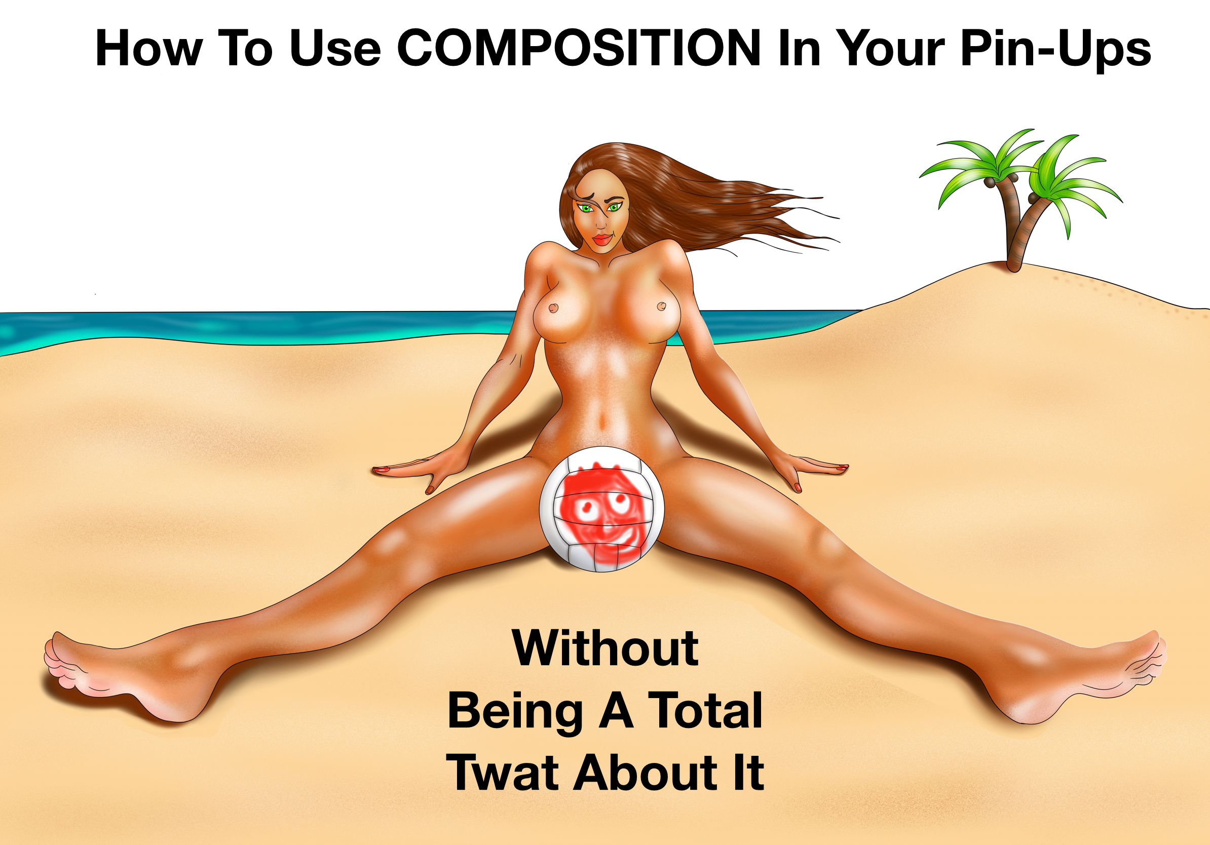
Below is how the final girl came out, the volleyball and caption are what make it fun for me, I think. Enjoy!
