Two Ways To Add Dramatic Contrast To Your Pin-Ups

The main reason I draw pin-ups is to make myself laugh.
That’s it. There’s no deeper reason. Except to also be my main creative outlet in life, to make me feel like I’m doing something more each day than just waking, going to work, and turning food into poop. I want to feel like I’m creating something with my time on Earth, not just consuming other people’s content.
But also because it makes me laugh. And it’s dumb. And I get to draw boobs and butts.
And it’s that dichotomy I want to explore today- these silly drawings you’re scribbling mean absolutely nothing, in the grand scheme of things. So who gives a fuck- take some chances, do something fun and unexpected.
But also, on a very small scale, they might mean everything- to your sense of who you are as a person, to your mental health, as a way to claim some agency back and calm down and enjoy your very limited time on this Earth. And that means you have to take your art study very seriously, as seriously as you do any other big pillar of your life.
But also also, I was very pleased with how this month’s drawing turned out, with the deep black background contrasting versus the light skin of the girls, and I think a lot of new pin-up artists might learn something from the process I took to get there.
Let’s get ready to tumble.
STEP 1: Initial Ideas And Sketches
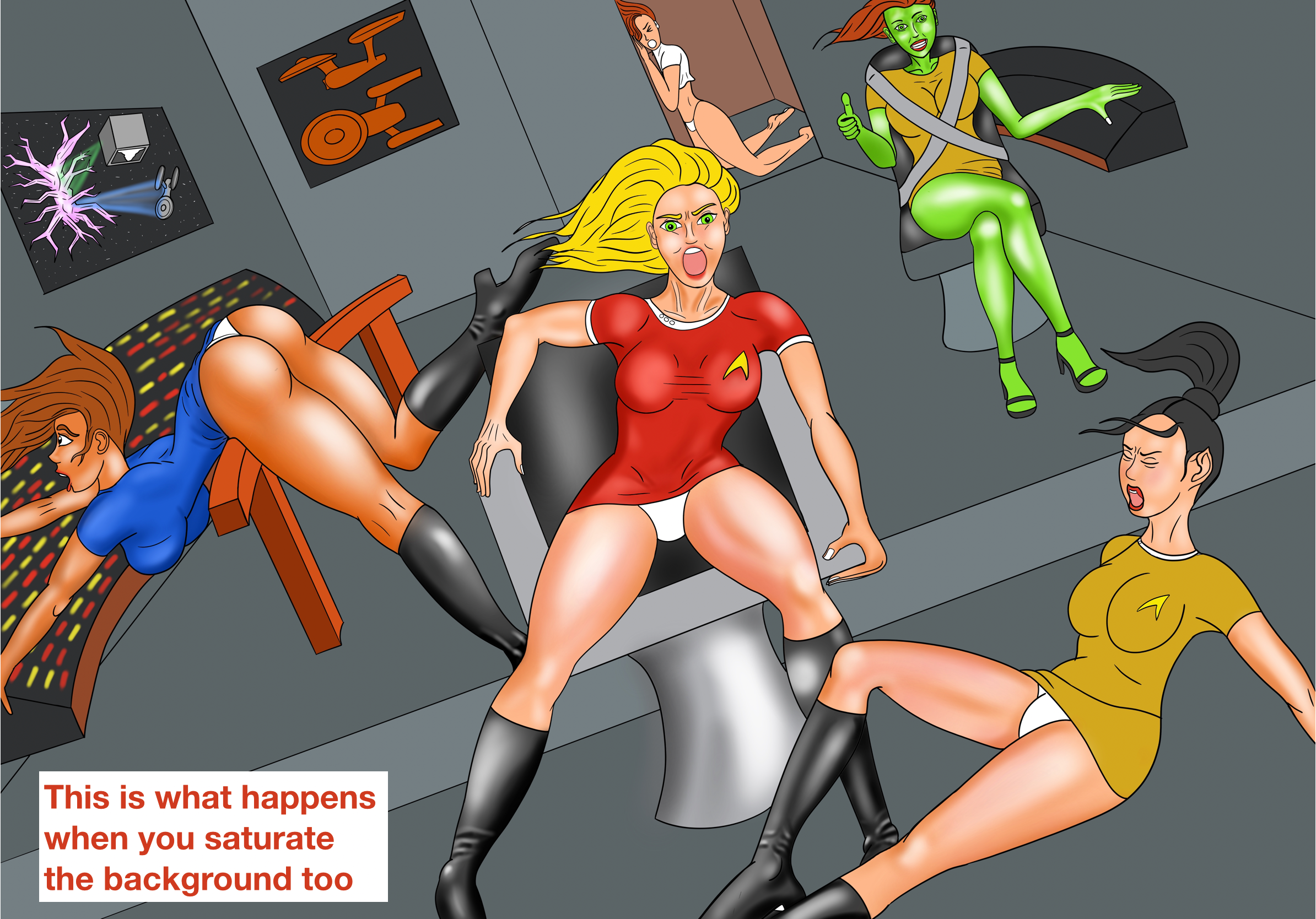
If you’re reading this on a computer and not a stone tablet, you’re probably too young to remember, but there used to be a TV show in the 1960s called “Star Trek”. (For younger kids… TV was a very old type of Youtube which auto-played 24/7 whether you were watching or not, but you could only subscribe to 3 channels and never rewind or skip the ads. It’s what modern Youtube is trying to become.)
And on this sci-fi show set in the far future of 2240, all the women for some reason dressed like sexy airline stewardesses from the 1960s, with tall go-go boots and short mini-skirts and sheer black pantyhose over their long space legs. You know, the perfect thing to wear while working as nuclear engineers on an active warship in the free-fall of space, which could get flipped over by a Romulan photon torpedo at any moment, sending all the bridge crew flying.
Which seemed to happen a lot.
To my fascinated child mind, watching Star Trek on a huge buzzing TV (yes they used to buzz- reddit reminded me just today that CRT TVs were literal particle accelerators aimed at our faces, for hours every day), it always seemed like those short mini-skirts were JUST on the edge of flipping up or spreading open, finally showing me what my child mind was so curious about but completely unknowledgeable on. (Still true to this day.)
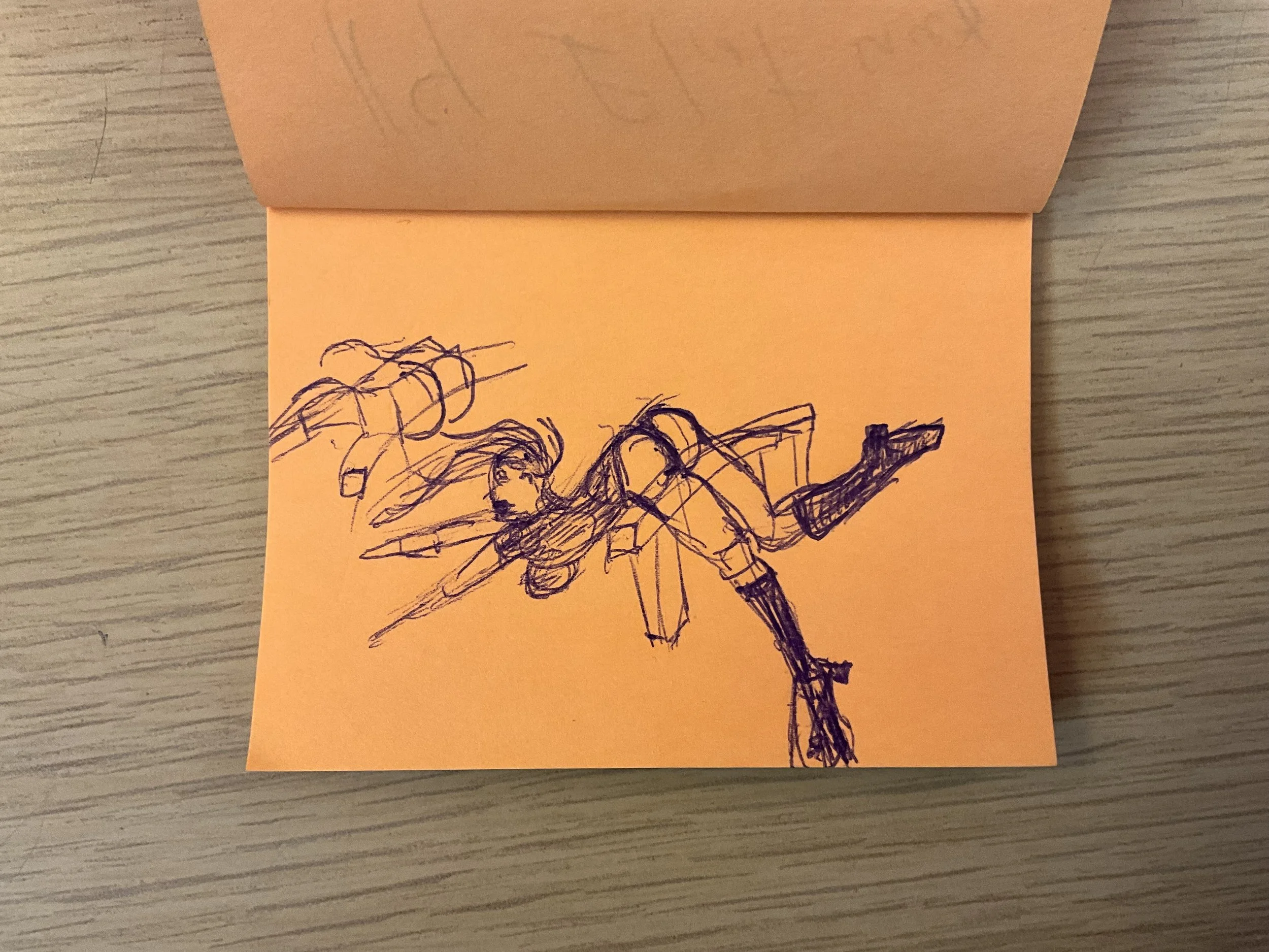
So it made me really laugh as an adult, when I doodled this first dumb sketch in my sketchbook at lunch one day, imagining if that scene had gotten past the network’s long range censors:

You can see I’m still trying to figure out blocking and proportions, and how many girls might fit into the scene, but I’ve already got the angle of the bridge, which will stay with this piece until the very end.
Of course it wouldn’t be a Lazy Pencil pin-up if I didn’t completely redraw this scene a few more times from scratch, as I encourge you ALL to do too, since that’s the only way one really understands the limits of the piece. Don’t get too precious about your first sketch- it will have the right idea but unsually never the right proportions:

What I really liked about this second sketch was an aspect I call “Little Girl, Big Chair”, which you can see in how the (now much smaller) captain is completely rattling around in a chair that might be literally, but also figuratively, too big for her to fill.
Things like Little Girl Big Chair happen completely by accident, when you’re redrawing your whole idea from scratch and not tracing over the first copy- things randomly get bigger or smaller, because we’re imperfect humans, (and that’s okay!) and some of those random mutations will be worth keeping around, all the way to your final piece!
You can see the second sketch also added room for a smart crew member in the top right who remembered to buckle up (they seem to have completely forgotten about seat belts in the 22nd century) and also room for a new ensign to be sprawled out, in front of the captain.
I actually ended up flipping that ensign around in the final piece, because she’s showing her butt and we’ve already got the girl-Spock science officer showing her butt, and the very serious goal here is to get as many different types of upskirts as possible into one shot, so that ensign had to go round the other way. I did a free hand sketch of that too, by the way:

You can also see I’m getting the room cage figured out, by the wall and floor lines in the background, to give the illusion of depth.
Why do I always show you all these ugly, rough, unfinished sketches at the start of every blog?
Because if you go follow your favorite artist on Instagram or Youtube Shorts, all you’ll see are time-lapses of them doing everything PERFECTLY, without a single line out of place, at 20x speed, leading speedily up to a finished piece that you mere mortals couldn’t HOPE to match.
For me, as a young artist, that was very demoralizing, until I randomly saw, in just one random Frank Cho book, how shitty his first initial sketches really were. I can’t match Frank Cho’s final results- no one can- but seeing those first sketches gave me the motivation of “Well, at least I can do THAT”.
Which I hope you all are getting too.
I also realized the Girl Spock can’t be bent over her OWN chair, that would put her face and arms too close to her own science station and I needed room for her to get REALLY bent over, butt high, to maximize the cheekiness, so I looked at a lot of reference photos of Star Trek bridges and realized at least half of them have this stupid little railing in them for no reason but to get in the way so redshirts can get comically flung over them. I was somewhere where I didn’t have access to my sketchbook when I realized a railing was perfect to get the angle of girl I wanted, so I sketched this quickly on a post-it note really fast:
So, when I finally felt ready to move to digital, my layout was a combination of FOUR different paper sketches, all at once:

So I’m glad I did so many initial sketches, from scratch, to explore all the things I might add to this piece and work most of the distances out.
Now let’s go digital.
Step 2: Digital Sketch and Line Work
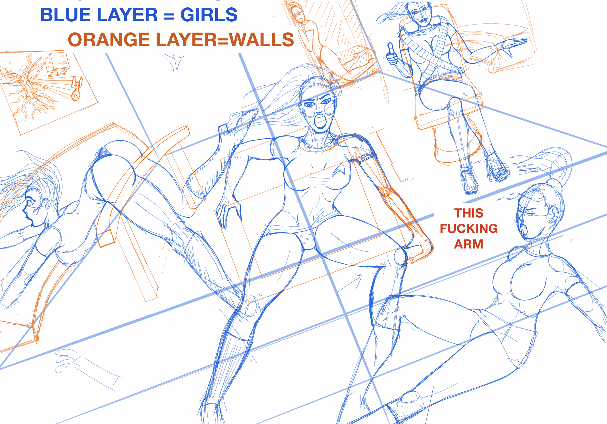
Okay, moving to my iPad, the first things I wanted to get right were the overall tilt and DEPTH of the room (remember our tutorial about being ‘an architect’ from the girl in car piece?) and the main Captain girl:

Doing the room first really helped, but that dumb stupid left arm is going to give me problems literally until the very end of this piece.
The main issue is, how to do Little Girl Big Chair, and have her arms straight like she’s holding onto a cliff, not doing a half-pull up, but not make the chair bigger, which would cover up the best parts of girl Spock’s legs to her right. Throughout this work I tried a LOT of different arm poses to try and get this right. So many.
But sometimes you’ve got to push on with an imperfect sketch and just say Fuck it, we’ll fix it later.
The whole scene, when digitally sketched out, looks like this, with the blue layer being the girls and orange layer being the ship (except for that fuckin arm, which I’m still redrawing in different colors):
That digital sketching is using two or more layers, but when I do my final inking before filling with colors, I put them it all on one layer, like this:
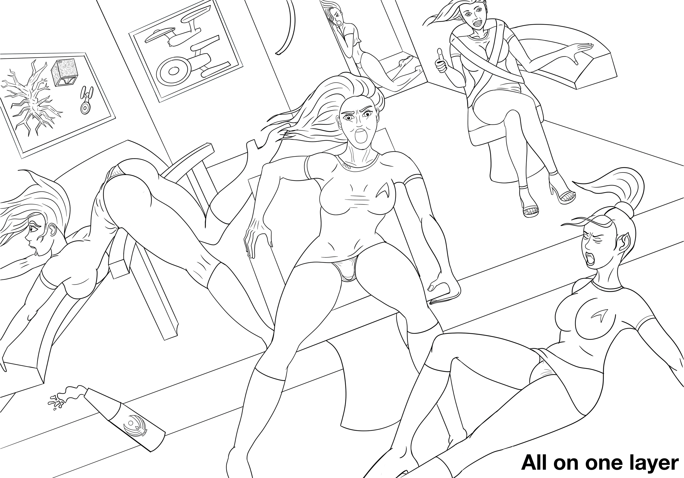
That might be a little controversial- the big benefit of digital is being able to scale and drag and edit something on one layer without messing everything else up.
But I’ve tried it both ways, and I find it’s simpler to have just one reference ink layer to fill, and cleaner to trim the ink lines of overlapping objects together, if it’s all on one layer together. You spend less time switching back and forth. But, you give up the ability to just drag a chair a little to the right without affecting the girl sitting on the chair. Your mileage may vary.
We’re ready to apply flat colors, but before we do, we should do a quick check to see if our pin-up is horribly misogynistic.
Step 3: Quick Check In: Is Your Pin-Up Horribly Misogynistic?
You can see I switched the smart crewmember above to be a girl instead of a guy, because it felt too condescending to have the one guy being the only smart one, in a room full of girls getting their panties shown.
To our modern eyes, Old Timey pinups have a lot of problems around consent, or punching down, or belittling the very women they want to show off, and that’s something I’m trying to stay away from, even as I’m trying to find excuses for consenting girls to be shown off.
Originally I had the idea of the captain being wide-eyed with fear (by exposing the whites above her irises- remember our 9 basic pin-up expressions tutorial?) but that and the big chair made her look too incompetent, so I went with the fierce, competent, Captain face instead.
She knows what she’s doing, it’s just some unfortunate gravity plus uniform choice and camera placement that’s showing off her panties to the home viewer.
And the fact that these girls are taking on BOTH the Borg AND the Crystalline Entity at the same time help proves their courage- when even one of those threats, by itself, would have challenged the OG Enterprise crews in their prime. So it’s okay to expect even a very competent crew to take a little tumble in their miniskirts, in such a battle.
(At least it’s not Conselor Troi stretching in a leotard in the hallway…)
Interestingly enough, the original 1960s Star Trek actresses were perfectly fine with wearing the miniskirts and go-go boots- it was even one of the female cast member’s ideas originally! This was the very start of the hippies/free love/mini-skirt era, and the in their own words, the actresses found it cutting edge, stylish and comfortable, and Michelle Nichols (Lt. Uhura) even called it “empowering”: https://comparativegeeks.wordpress.com/2016/05/07/star-trek-miniskirts-feminist-or-nah/

So, overall, in my pin-up, even though they’re technically not consenting, hopefully it comes across as a little bit more cheeky fun and not creepy exploitative.
Either way, it’s time to start coloring.
Step 4: Coloring and You’re Doing WHAT With That Background??
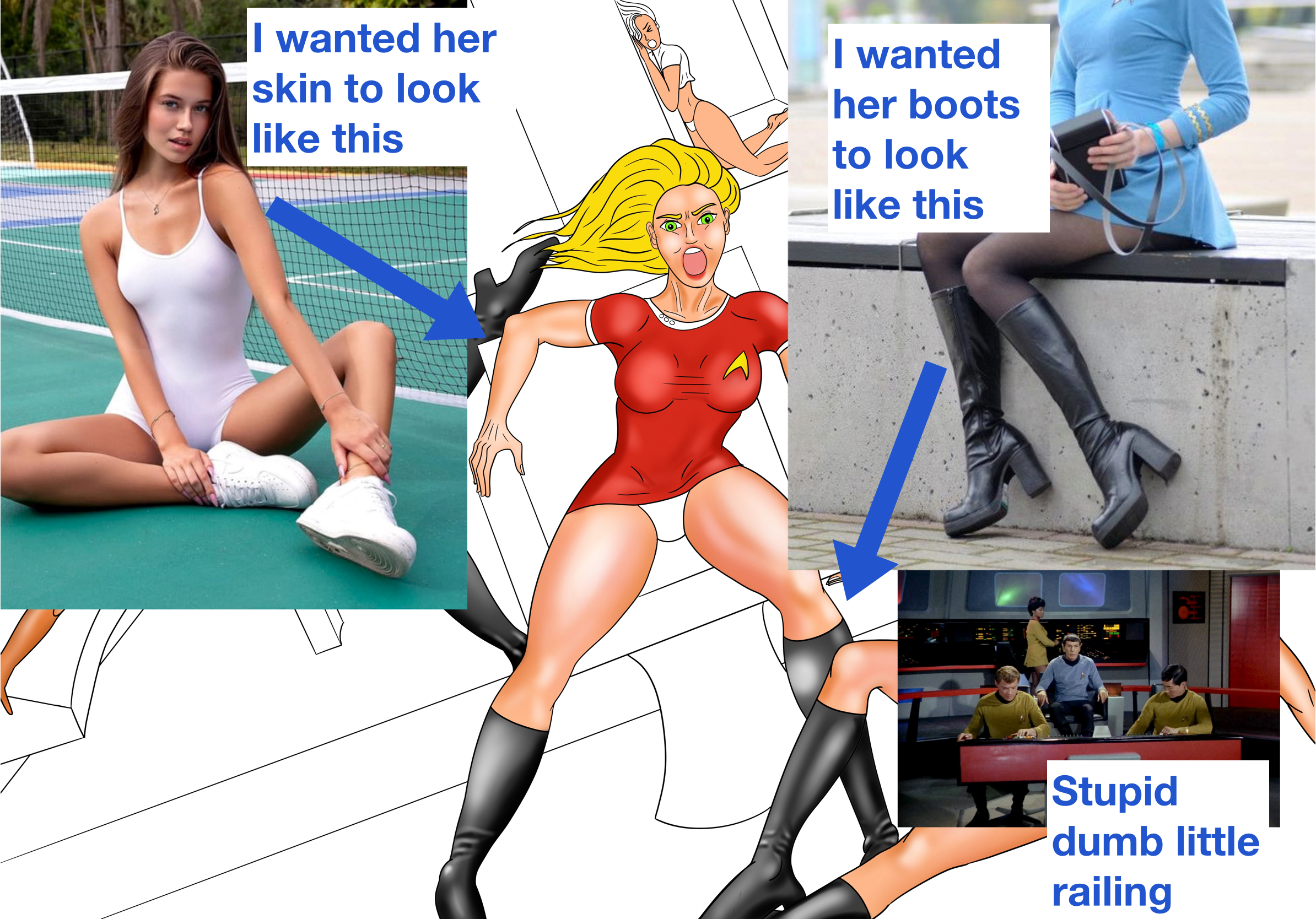
To me this is the fun part of a pin-up, where things really start coming to life. I always color and shade the girls before the background. Make sure you’re using a lot of references while you do:
And the goal is to end up with something like this:

And the question always is: Should I stop right here?
I LOVE how the girls POP against that white background- you guys know how I love contrast and this contrast is a very strong one, between the saturated girls and a completely non-saturated white background.
You can see me do this in my early “Hot Coffee” pin-up on this blog, and my most recent “Knockouts”.
It’s a very clean look, puts all the focus right where I want it, and is well supported by pin-up history. A lot of the great Gil Elvgren pin-ups from the 1950s-1960s were skin-toned girls floating above white backgrounds.
Furthermore, every time I try to ‘realistically’ shade in the background, I end up with something blah like this:
Not as poppy, right? It’s… okay, it just doesn’t have the PUNCH of the Flesh-On-White version.
You can see it even more in a pin-up I haven’t released a tutorial on yet:

I struggle with this a LOT, whether to shade the background or keep it white with inks. Usually I’m much happier keeping it white, with some light lines to hint at structure and items and walls, like I did with Knockouts:
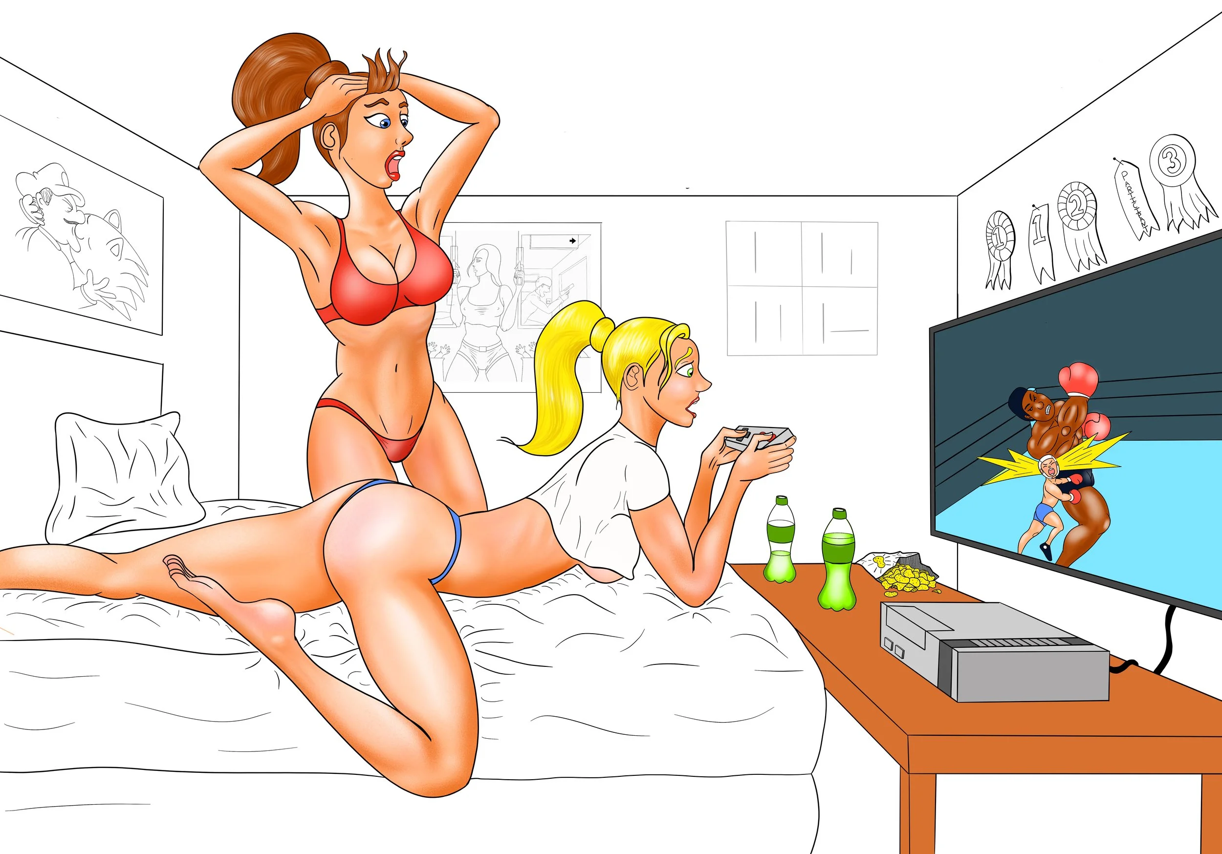
Instead of a black and white, I call this my “Flesh and White” style, and I think I’ll probably use it for most of my pin-ups going forward. That’s the look I want to be known for. (What’s yours? It took me a long time to be able to answer that question.)
But in THIS specific case- this is a tutorial about CONTRAST after all- there is another type of contrast that is as dramatic as Flesh-On-White; - and thats between dark and light. Based on the J.J. Abrams Star Trek movies, that looks pretty dramatic as well, so I bit the bullet (after saving a back-up) and went for the dark dark contrast in the room:
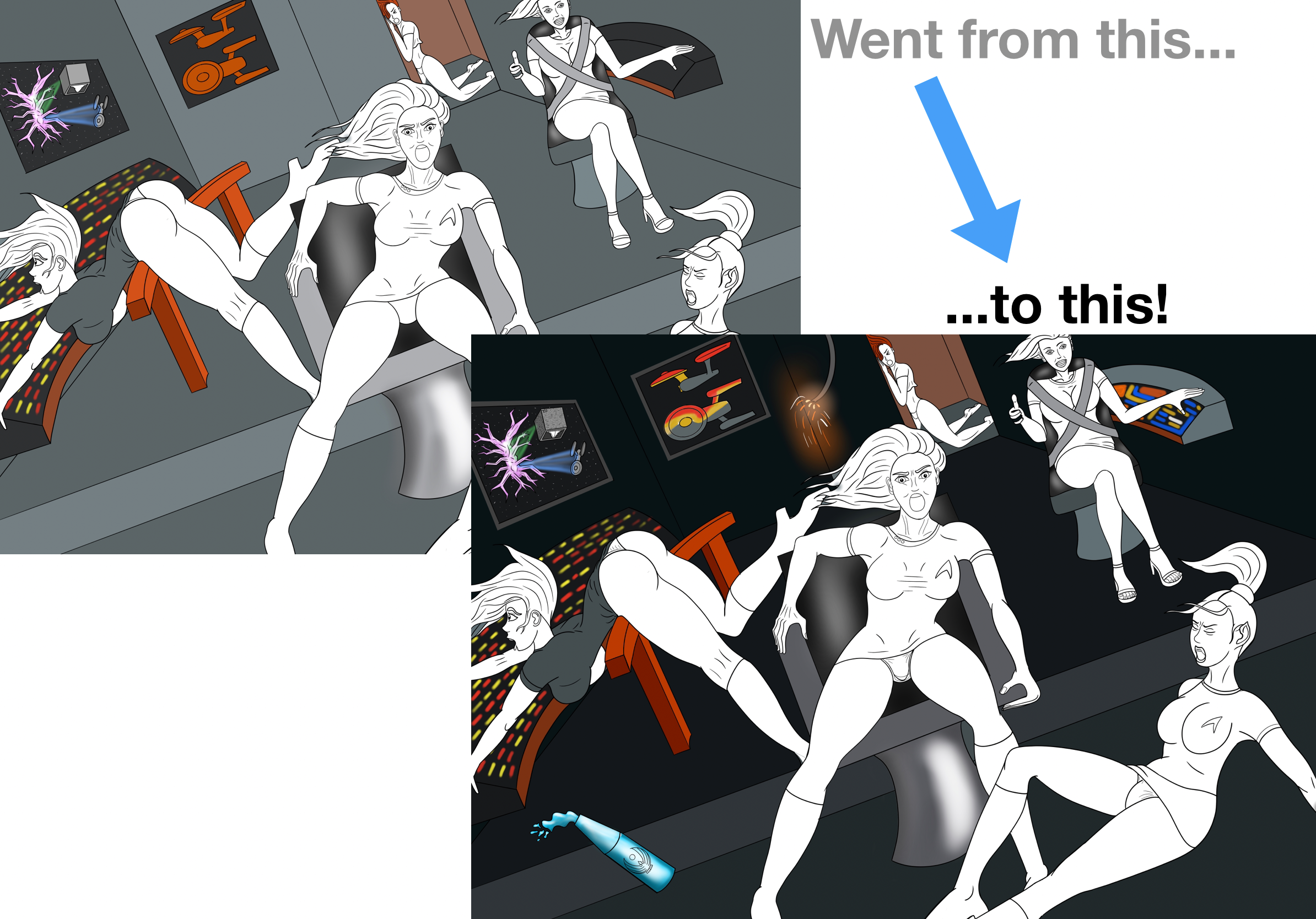
It’s always scary making a global change like that, I’m worried here about blasting too many of my background details out and taking away from the girls, but take a risk, save a backup and once you add the girl colors back in, in some cases, you might get something really poppy like this:

I love how that Captain’s red shirt came out.
I love that little electrical wire swinging in the background (photon torpedos always seem to cause those).
And I love how dramatic their panties are against this background.
So, to recap, in my opinion, you’ve got two options, if you want a powerful, dramatic, punch-you-in-the-gut pin-up that really stands out from the crowd:
You can either go “Flesh-On-White”, making your girls the MOST SATURATED thing above a white/blank/desaturated page,
Or you can go “Flesh-On-Black”, making your girls the BRIGHTEST thing against a dark dramatic shadowy page, like I did here.
Just be sure you know which one you’re shooting for. Half measures won’t get you there.
Hope this helped, and if you ever have feedback or ideas for other tutorials, you know where to find me!